In this workshop ‘Between 2 Walls’, we have explored and experimented with weaving and knitting to create different styles of exterior facade of our two hotels that we are designing. The built fabric is the ‘nature’ of the city. Sll the key elements that we have encountered throughout this workshop have been applied to the hotel surface design and those elements have created some interesting looking ‘enclosures’ with a sense of space/spatial quality being added to them. Manual hand weaving in combination of using 3D computer modelling tools and virtual world(Secondlife), have generated synergy to achieve successful processing of design.
The idea behind correlating the imported mesh into the hotel exterior design, was to try to illustrate a space that could be used for an entrance foyer or some public space that all customers would use frequently. Because the mesh/panel created a dynamic view of the scenery outside, with the added contrast of straight edged walls and glass ceiling, it really emphasized the interesting pattern and curvature of the mesh wall, creating an intriguing space for people to enjoy when walking through the entrance/foyer. The panel idea was to express a sense of biomorphism in some aspects, but using advanced technology to achieve this - in other words, the idea links back to the Ultimate city, as the metropolis was a failed attempt at creating a new revolution of life through technology. This same philosophy was applied to this ‘building’/exterior, as we wanted to emphasize the meshes’ technology, and how it stood out from the rest of the structure, giving it the feeling of empowerment over the rest of the walls and other structures. With some color, editing and rendering, we were able to create an illustration of the screenshot from second life to give a sense of what that part of the hotel could potentially look like.
Over all, the whole idea of this exterior part was to represent the ideas of the two cities from the Ulitmate city, the garden city and the metropolis. The metropolis would be regarded as the panel - that it is a sign of technological sophistication that ideally takes over the building, drawing in attention. The rest of the building - walls and glass panel ceiling represent the idea of the garden city, as the form is rigid, straight-lined and looks modern, but was created and developed in a very simplistic classical manner. Through the two ideas, we have created a ‘potential’ exterior to one of our hotels, that tries to balance the two ideas that were drawn out from the Ultimate city story.
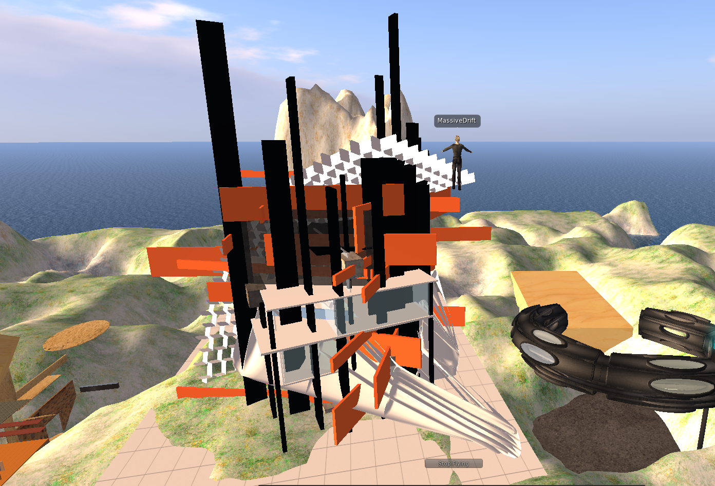
The first thing to focus, from the surface design, is the idea of weaving that has been adapted to the surface of it. As shown on the image, vertical and horizontal planes interlock each other which creates a similar moment where two threads of string getting orthogonally weaved each other. It does not just add aesthetical value to it but also it is structurally working since the pieces are all joined and fixed so that all they lean and rely on each other keeping the whole structure strong and tight. Also in other point of view, it is also can be interpreted as a type of deconstructive architecture since it looks very different from traditional architectural conventions buildings but keeps its utility, basic laws of physics and the spatial value even with abstract and sculptural look.
There has been a lot of digital work to produce such design/imagery. Rhinoceros, 3Ds Max, Secondlife and Photoshop are the main tools that I have used. The roofing and the base of the concept were all modelled in combination of rhino ceros with Grasshopper and 3Ds Max. They are ‘weaving’ that has been done digitally also can be refered as ‘parametric surfaces’ which are computer calculated/generated form of planes with assymetry and smooth curvature.
Since every elements have some sense of weaving, there has to be a lot of ‘holes’ on the surface. They may generate some terrific luminosity effect which lead to different types of lighting/shadow patterns that are aesthetially pleasing.
These elements got combined together creating a whole new interesting enclosure for the hotel. I has some kind of tactility involved for this surface design where the form and materiality gives a cold, high-tech, abstract, confused and congested feeling. The feeling of it is associated more with dystopia/metropolis where there were over-use of technology.
When we started to build the detail, we supposed that it could work as the reception room in the hotel with a unique outward appearance. However, after finished, I suddenly felt that it looked like a view station much more. I changed the premier idea and tried to photoshop it as the balcony. I copied the same image several times and connected it as the outside stair of the hotel. I also hoped it take the effect of the outside mesh to reduce the noise and light pollution. Then the strange and fantastic patten which formed by the repetition and combination of the image panel attracted me and showed a sort of development. All of those made me come up with the basic idea of the hotel: there may be a hotel which is a summary of all the architecture styles in the ultimate city. Therefore, in the picture, the front door is dark, classical with little Gothic style. Through a long time development, the hotel changes to a bright and modernize tones. I tried to make the picture like an oil painting to cultivate hazy beauty.


.png)
.png)


