


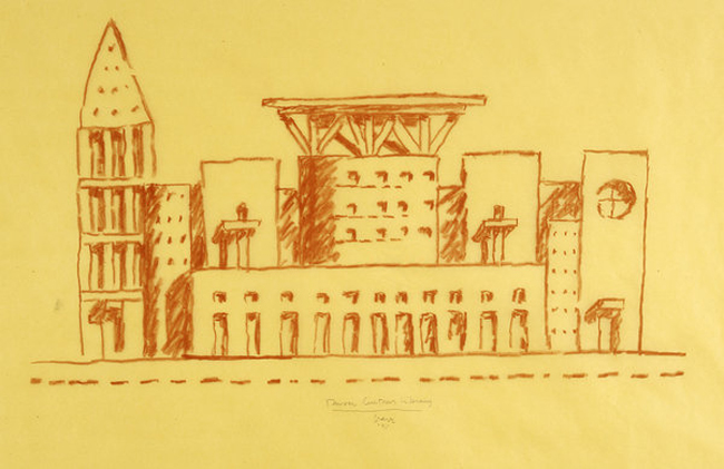
the final plant room of Auckland hotel


the final plant room of Waiheke Island


The plant room of waiheke island was supposed as a gathering and meeting place between two parts of the hotel. Therefore, it should be an open and bright space, which lead us set the gap a little bit bigger than the normal one and can hold the whole frame at the same time.
the first test for the plant room


At the beginning of this workshop, we tried to explode different connection methods and use them to structure a whole frame. Sometimes, even just a simple joint, we can also create a charming project by rotating and repeating it.


peer review for stairs
During the observance,we had a peer review at the end of this workshop and would get some general idea for the next
work shop. Fortunately, this time, it is group “kjs26” introducing the next “ between two floors”
workshop for us, and showing their achievements during this two weeks.
work shop. Fortunately, this time, it is group “kjs26” introducing the next “ between two floors”
workshop for us, and showing their achievements during this two weeks.
Unite have designed two different and interesting sets of stairs both with intricate details dealt with
in unique ways. The first set of stairs described were for the Utopian hotel and named as “shell
stairs”. They were interested and influenced from Zaha Hadid's sculpture, interested in form- the twisting element in the form was something they wanted to convey.And the team also wanted
to convey something light weight looking and elegant and fluid.
The stairs wind up and through the hotel in a vinelike manner that was inspired by the structures
the team had made in the previous workshop ‘between two floors.’ Consistent with the design of
the hotel, the stairs begin at one singular point and then begin to weave up, around and through the
multiple levels of the hotel. They encourage exploration throughout the hotel and create an
experience in their own due to the irregular shapes and forms created. Different areas of the stairs
mean that people can sometimes stand and walk normally or at other times they may have to climb
more abstractly to access areas of the hotel. These ideas and design further solidify the team’s
intentions for creating a new experience and explorations. This idea was portrayed in some images
more clearly and sophisticated than others such as the sections however we would encourage the
team to be aware that some of the other renders appear as though the stairs are quite overwhelming,
large and dominating around the building and if this was the feeling they wanted to portray a slightly
clearer description may have aided Unite’s ideas.
The other set of stairs for their dystopian hotel sit at the opposite end of the spectrum conveying a
heaviness and more solid aesthetic. Naming the stairs was an extremely effective way of getting
their ideas across. But the team hasnt used many pictures to show it.
heaviness and more solid aesthetic. Naming the stairs was an extremely effective way of getting
their ideas across. But the team hasnt used many pictures to show it.
The teams models were had been cut with the CNC machine but had not been assembled or
extracted from the polystyrene block however we could still get a rough understanding of the
physicality of the stair designs. They spoke of possibly casting one of their designs in the moulds
cut by the CNC and we look forward to seeing the castings created to really heighten their ideas.
extracted from the polystyrene block however we could still get a rough understanding of the
physicality of the stair designs. They spoke of possibly casting one of their designs in the moulds
cut by the CNC and we look forward to seeing the castings created to really heighten their ideas.


Peer review for the Plant room's TPW
Peer Review #4; TPW.
Plant room studio.
What was expected:
-
2x plant room models, scaled.
-
Some supporting
drawings/documents of plant room/atmosphere.
-
Matrix.
TPW presented two plant rooms for the peer
review, and a minimal amount of supporting documents to reiterate their design
ideas. However, the two plant rooms were very well crafted, and illustrated two
different types of atmosphere and experiences. It is clear that one plant room
seemed to have some more attention and detail then the other, but nevertheless,
both were completed to a good standard.
The first plant room was a rectangular room
made out of clear perspects with a wooden slat ceiling/roof. This ceiling hung
an array of perspect shapes that were delicately held together by tiny precise
joinery. This created a cluster of layered perspect shapes that were
intricately held together and tied up by nilon strings. This attention to
detail and consideration to light and atmosphere, significantly contributed to
this plant room’s success. It was easy to identify the type of atmosphere it
would provide just by looking at the model, thus it was very effective. The
fine detailing made the plant room model look a lot more feasible and was an
interesting moment of the model. Architecturally, it was simple in its form,
but the ceiling details really contributed to this plant room’s mesmerizing
effect.
The other plant room created was just made
out of MDF. It was a teardrop like shape in its form, and was created in
decreasing layers – creating a dip in the plant room. The group’s explanation
of this plant room was a little confusing; they didn’t narrow into any
justification or specifics of the design. The atmosphere and other elements
such as light, comfort and composition, felt like it wasn’t sufficiently
considered, as the design did not reflect any of these ideas.
However, the form of this plant room was
aesthetically very fluid like and was a nice contrast to the other plant room.
Scale was also another aspect that wasn’t explained, thus it was difficult to
determine what kind of space this plant room would provide for people.
In the media agenda, photo shop and
illustrator files were used. Illustrator for the laser cutting, and photo shop
for extra material. They used perspects and MDF boards; therefore it provided a
nice duet of material that mutually harmonized with each other, rather then
clustering the design with too many different types of material.
Over all, TPW’s plant room designs did have
some very strong ideas, in correlation with models that were lacking
justification. The first plant room was indeed very strong, and illustrated the
atmosphere and logic behind this studio very clearly. However, the other didn’t
quite show as much. More work could’ve potentially been included in drawings –
there were no sections or plans that supported these models. This made the
plant room design feel out of scale, as there wasn’t a human model in the
model, nor a scale drawing of the plant room.
The Tricycles.
Architecture and the Lost Art of Drawing - Michael Graves
Michael Graves (born July 9, 1934) is an American architect. Identified as one of The New York Five, Graves has become a household name with his designs for domestic products sold at Target stores in the United States.
In ARCHDES101, Design 2, 2012, we are radically focusing on architectural design process that is vastly influenced through computers and technology. Computer transforms every aspect of how we work, from sketching our first impressions of an idea to creating complex construction documentations for upcoming discussions, crits and peer reviews.
“Architecture cannot divorce itself from drawing, no matter how impressive the technology gets. Drawings are not just end products: they are part of the thought process of architectural design. Drawings express the interaction of our minds, eyes and hands. This last statement is absolutely crucial to the difference between those who draw to conceptualize architecture and those who use the computer.” - Michael Graves
I personally agree with this quote. Computers and technologies are mere tools to communicate and investigate the creative design and problem solving. Same applies for other mediums such as pencils, pens, markers, coloured pencils, pastels, paint, etc. Which means that we cannot design properly without being able to draw and render by hands. Sketching is a fundamental part of the architectural process which should never get taken over by computer drawings and technology. This does not mean we're against to the contents we learn in the four workshops such as CNC, laser cutting, 3D printing, ArchiCAD, Rhino, Second Life, 3Ds Max, Photoshop, Illustrator or whatever they are, but I think they should not be the tools that will affect our elaborative thinking, creative thinking, concept ideas which can be successfully achieved with sketching/drawing. The drawing has a real purpose of either to remember something or to study and each one is part of the design process.
Michael Graves claims that:
- Drawing is a reminder of the idea and these sets of drawings, visceral connection, cannot be replicated by a computer.
- Drawing keeps the design process broader. (not as linear as computer-aided design)
- Drawing creates a personal and emotional connection with the work.
- Drawing keeps us in a certain joy of our creation, which comes from the interaction between mind and the hand.
"I find this quite different from today’s “parametric design,” which allows the computer to generate form from a set of instructions, sometimes resulting in so-called blob architecture. The designs are complex and interesting in their own way, but they lack the emotional content of a design derived from hand." - Michael GravesIn my opinion, Parametric design, even though it is calculated and created by computer, it can still be as emotional as drawn/designs derived from hands. Just like in the past workshop, we have started surface designs of the hotels with weaving/knitting which has a lot of association with our hands and it requires some concentration and effort. We can also draw out anything that inspires us or whatever that comes up in our minds that could be related to our hotel designs. Not just because they are simply pretty artifacts but to explore, think and study more about through the drawings. After doing that, we can apply the parametric equations and computer technology onto what we have designed/drawn to keep the parametric designs, blob architecture or computer generated piece to be a lot more emotional or 'humane'.
In conclusion, Design 2, so far, seems to be too reliant on computers and technologies which may be very useful and convenient throughout our architectural life. And we publish posts on the blog in chronological order which may look like "design process". However, we should not forget that this cannot replace the thinking and design process that has been derived from drawing and sketching.
Article Link :
Cups and Jandals
A) Handless coffee cup
B) Jandal / Sandal
C) Create a material and apply it


